

Open an app and it should feel like it knows you, not like it needs a tour. UI/UX trends in 2026 are about that feeling. It’s about design that respects time, removes friction, and feels obvious the moment you touch it. The best teams are getting ruthless about fundamentals, clear hierarchy, fast loads, readable type, and honest interactions. That foundation carries forward, and it wins.
New tools do matter, as long as they earn their keep. AI, spatial interactions, and smarter personalization are stepping in to handle the heavy lifting, while the interface stays quiet and helpful. The result is simple on the surface, powerful under the hood, and consistent across every screen your users rely on.
This guide breaks down what still works, what finally works, and where to place your bets for the next year of product decisions.
Get the Basics Right
We are seeing that you need to build the basic foundation first only, before thinking about fancy 3D buttons or holograms. As per current trends, these practices are already working well and will keep giving good results regarding 2026 also.
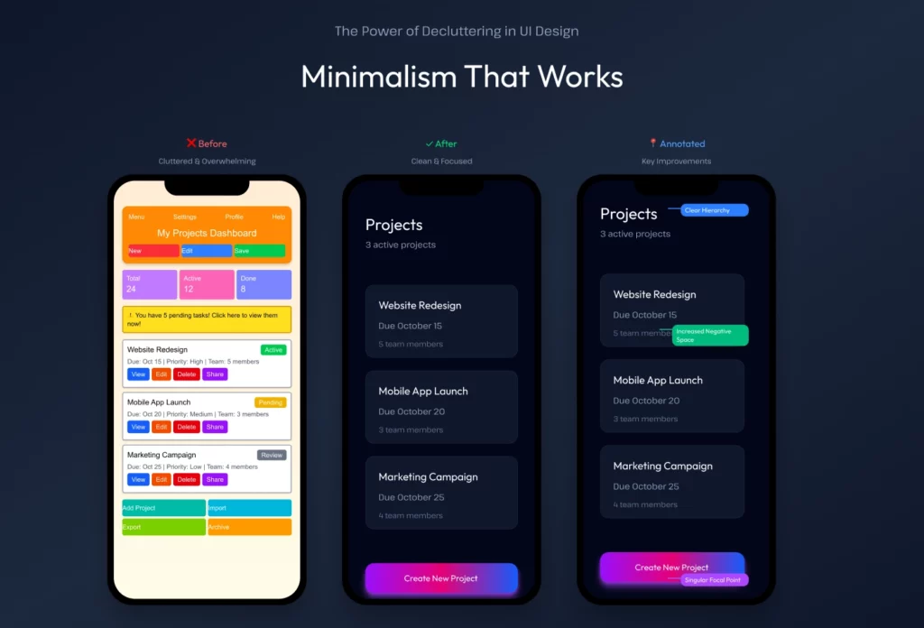
Minimalism That Works
Minimalism doesn’t mean empty. It means every element has a reason to exist. The effect is focus. Users don’t waste time hunting. Their brains can relax because the screen isn’t fighting for attention. Good minimalism isn’t about removing things. Basically, you show the same amount that’s needed, and only when it’s actually important.
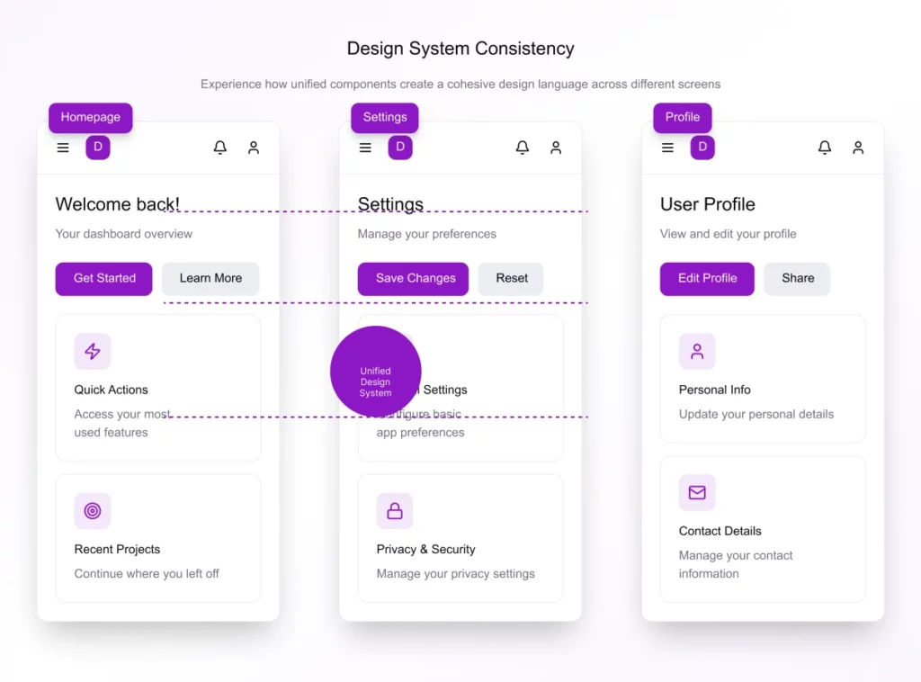
Consistency
if one button has rounded corners, then all buttons should only have the same rounded corners. As per design standards, the menu should stay at bottom position only and not jump to top regarding different screens. Basically, when an interface looks and works the same way everywhere, users trust it more.
Google has nailed this with its suite of tools. Move from Gmail to Docs to Drive and everything feels familiar. That’s not just branding. It’s a design system at work. Users don’t think about it, which is the whole point.
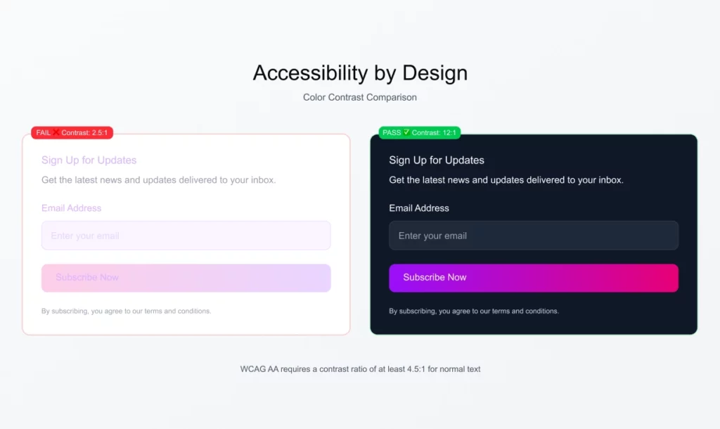
Accessibility
Accessibility has been important for some time, but regarding 2026, it will expand more into inclusivity and neurodiversity, making it even more central.
The core principles remain the same: alt text, readable contrast, scalable layouts, clear labels, and keyboard-friendly navigation.
These are not optional additions. They are essential requirements for success. These examples show that inclusive design has further become part of the basic standard itself.
Here’s what makes inclusive design tick in 2026:
Customizable interfaces. Let users adjust contrast, font size, spacing, motion, or even switch to distraction-free modes. Flexibility is the new accessibility.
Predictable patterns. Neurodiverse users rely on consistency. Clear layouts, steady navigation, and predictable feedback reduce cognitive load.
Simplified content hierarchy. Break complex information into digestible chunks with clear headings, visual cues, and short sentences.
Calm design. Fewer pop-ups, flashing elements, or autoplay videos. Interfaces that respect focus and attention are inherently inclusive.
Clear language and tone. Write plainly. What feels “creative” to some can feel confusing or overwhelming to others.
What’s New in 2026
Once the basics are tight, zoom in on what is changing. Not party tricks, real shifts in how people expect to use tech.
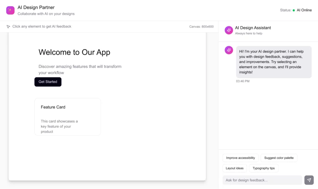
AI as a Design Partner
AI is now a junior designer in the room. It can generate layouts, color schemes, and variations in seconds. Figma and Canva already use this.
But AI doesn’t replace taste. It can flood you with fifty options, but only a human knows which one feels right. The designer’s role is moving from pixel-pushing to curating and refining. The upside is speed. Iteration that once took weeks now takes hours.
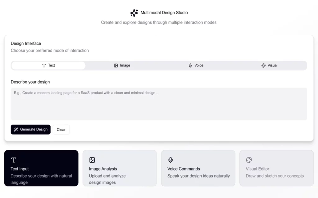
Multimodal Design
The voice used to be clumsy. In 2026 it finally works well, especially when paired with visuals.
Voice plus visuals is more powerful than either on its own. This matters because life isn’t always hands-on. Driving, cooking, carrying a baby, voice frees your hands while visuals keep you grounded.
Search and navigation:
Voice search is the low-hanging fruit. Let users say “show me winter jackets” or “find pricing plans.” Great for e-commerce, documentation, or content-heavy sites where typing is tedious.
Guided experiences:
Think recipe sites that narrate steps, online workouts that listen for next, or tutorials that let you move forward without touching the screen. Voice turns passive content into an active guide.
Accessibility features:
Voice navigation can help users with mobility or vision challenges explore your site hands-free, saying scroll down, read more, or open menu.
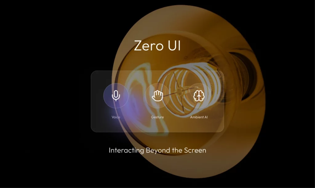
Zero UI
The foundation of this approach is context awareness. Devices sense location, timing, and behavior to adapt automatically. Interfaces stop being visible layers to control, and start functioning as quiet assistants.
The benefits are clear:
- Less cognitive load — users don’t waste effort making small decisions.
- Faster interactions — outcomes happen instantly without hunting through menus.
- More human flow — people focus on the task, not the tool.
Zero UI pushes designers to think beyond buttons and layouts. The challenge is creating systems that anticipate just enough, without overstepping or confusing the user. When done right, the design fades and the experience feels effortless.
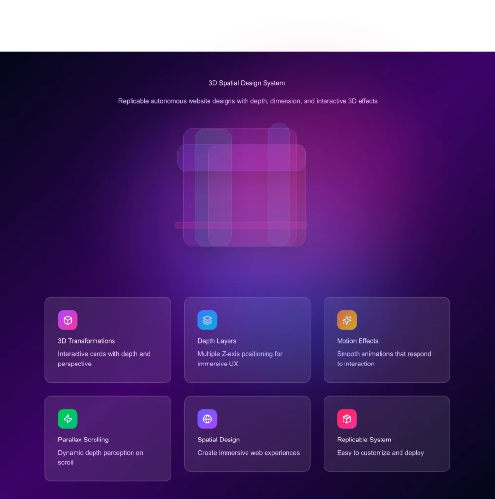
3D and Spatial Design
3D in design isn’t new, but it’s having a huge comeback. More product companies are using it to make interfaces feel alive. Buttons tilt, cards move with your cursor, and depth guides attention better than flat layouts ever could. The tech is finally fast enough to make it smooth, and users now expect it.
Humans instinctively treat objects that appear closer as more important. Interfaces can use this instinct as a hierarchy, primary actions sit in the foreground, while secondary details step back.
This approach also reduces clutter. Instead of cramming everything on one plane, information is separated into layers. The result feels more organized and less overwhelming.
Motion reinforces this sense of space. Elements that slide, tilt, or scale behave like objects in the real world. That familiarity makes interfaces easier to understand without extra effort.
Source: mola-zone
Motion That Matters
Animations aren’t new, but in 2026 they’re used with restraint. Motion has a job: to guide, confirm, and reassure.
Small movements help users understand what just happened. A button ripple confirms a tap. A smooth fade signals a page change.
Motion also directs attention. Subtle shifts can highlight what’s important without shouting for it.
The key is speed and smoothness. If it’s too slow or too flashy, it distracts instead of helping. Good motion feels invisible, you notice the effect, not the animation itself.
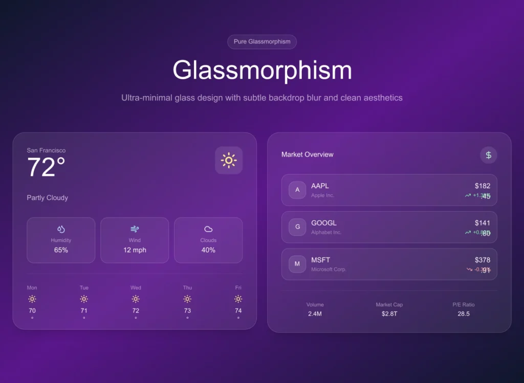
Soft UI and Glass Effects
Neumorphism looked exciting at first, but it failed users. The soft shadows were stylish, yet they blurred the line between what was clickable and what wasn’t.
The refined version, often called Soft UI, keeps the tactile feel but fixes usability. Elements look touchable without confusing the user.
Glass effects add another layer. Blurred, frosted panels create depth while keeping text clear and content readable.
The trick is moderation. Use these effects to highlight key areas, not everywhere. When applied sparingly, they add polish without hurting clarity.
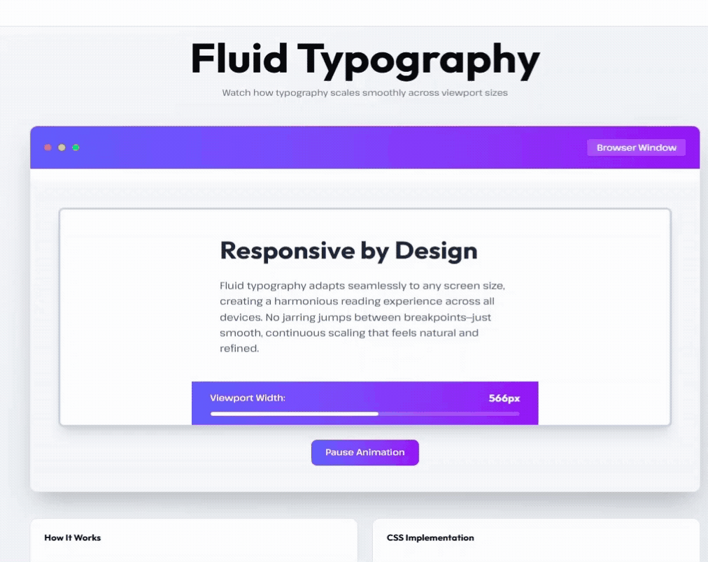
Fluid Typography
Typography in 2026 isn’t fixed, it flows. Fluid type adapts to screens, users, and context, creating consistency without rigidity.
Why it’s beneficial:
- Better readability: Type scales smoothly across devices, keeping line lengths and proportions perfect.
- Stronger branding: One variable font keeps your visual identity consistent everywhere.
- Performance gains: Fewer font files mean faster load times and cleaner code.
- Accessibility built in: Users who enlarge text or adjust settings still get a polished, readable layout.
Designers use variable fonts and responsive units to make typography flex automatically between sizes
Type can also react to user behavior, growing subtly during reading, animating on scroll, or shifting tone when voice input is detected.
Fluid typography isn’t decoration, it’s adaptability turned into brand expression.
Wrapping It Up
Some ideas keep earning their spot, minimalism, motion with purpose, accessibility built in. They carry into 2026 because they work. Others, AI-assisted design, zero UI, spatial interfaces, are finally practical and worth using where they add real value.
The thread through all of it is clarity. People do not want decoration, they want products that feel natural, fast, and human. That is how we design and build at Autonomous. The best design surely works so well that people do not discuss it at all. When something functions perfectly, it becomes invisible to users.